Why a Makino isn’t enough
Stop competing on price! Learn how to combat commoditization — exemplified by the Makino’s effect on the manufacturing industry.
At Kinesis, we're in the business of transformation—which can take shape in a number of ways. One important way we help our clients transform is by telling their story in a visually compelling way through a rebrand.
As you'll see below, the scope of a rebrand can span from a website redesign, to a complete visual overhaul, all the way to a rename and shift in business identity. Here are some of our favorite recent client rebrands.
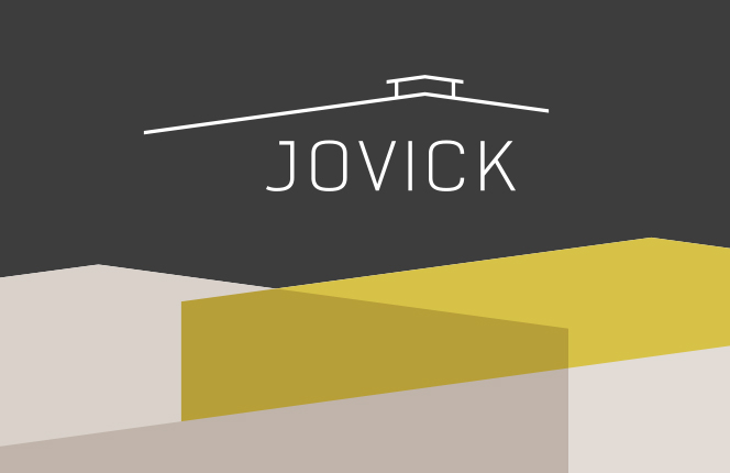
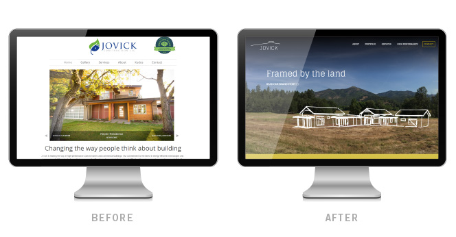
Jovick specializes in building high-performance custom homes, ranches, wineries, and commercial projects—and their approach to design / build is deeply rooted in the terrain that surrounds their Southern Oregon location. This theme—construction framed by landscapes of rolling hills and stunning forests—was a key component of their brand story and website design.
Their new logo is something of a clever optical illusion: Through one perspective, we see a a house sitting on top of a hill; through another we see roof line with a cupola resting atop. This signifies the mirroring and union between nature and structure, and reflects the character of Jovick's work.
The textured graphics used throughout their branding are also a modern interpretation of their local landscape—an abstraction of layers of hillsides shadowing one another on the horizon.
![]()
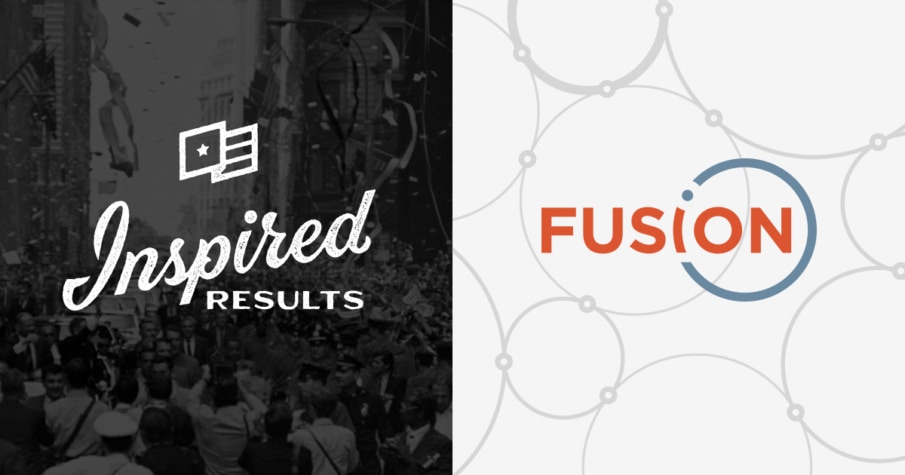
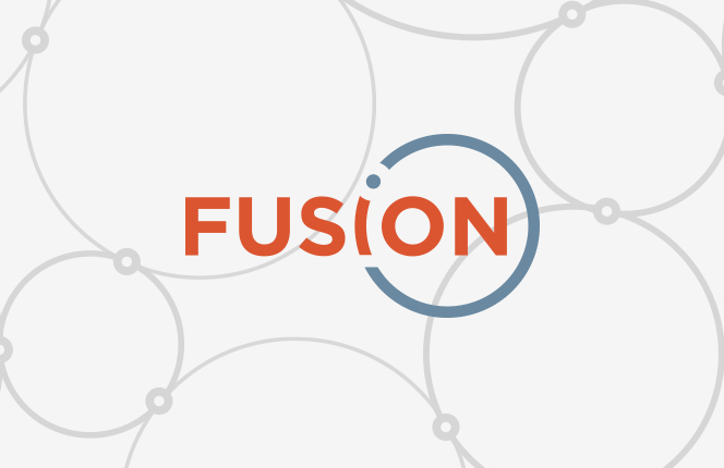
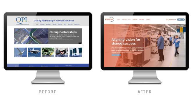
Fusion is an electronics manufacturing service (EMS) provider which serves OEMs of all sizes. Originally named Quality Productions Ltd. (QPL), they came to Kinesis seeking a brand that adequately demonstrated their company-wide commitment to connection. In this case, rethinking their business identity also meant a company rename toward a succinct but poignant epithet.
Fusion embodies the concept of strength in unity, and that the whole is greater than the sum of its parts. We used custom photography throughout their brand to display their dedicated people and collaboration-inspired facility.
Emboldened by this concept of unbreakable bonds, our team also set forth on developing a brand story which leveraged the principles of quantum mechanics. Their logo emulates an environment of atomic particles, with the final three letters shaping the word "ion."
![]()
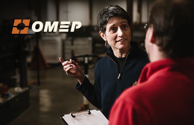
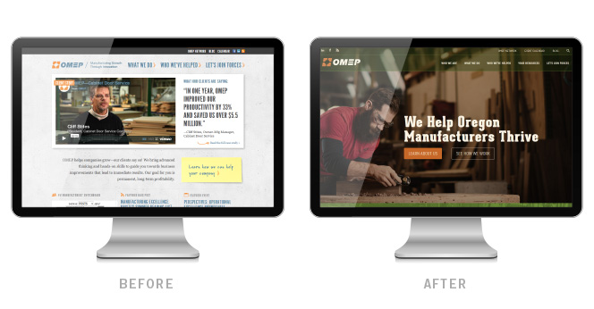
Oregon Manufacturing Extension Partnership (OMEP) is a non-profit organization which helps Oregon manufacturers compete in a global economy. We've been a proud partner of OMEP's for several years now—and recently, they decided to elevate their brand presence with a new, responsive website.
We also used this opportunity to refresh OMEP's logo and brand colors: Capitalizing on their strong ties with the state of Oregon, we developed a color palette which embraces the region's rich forests and natural history.
Custom photography is leveraged throughout the site to highlight their engaged team of consultants, as well as manufacturers at work.
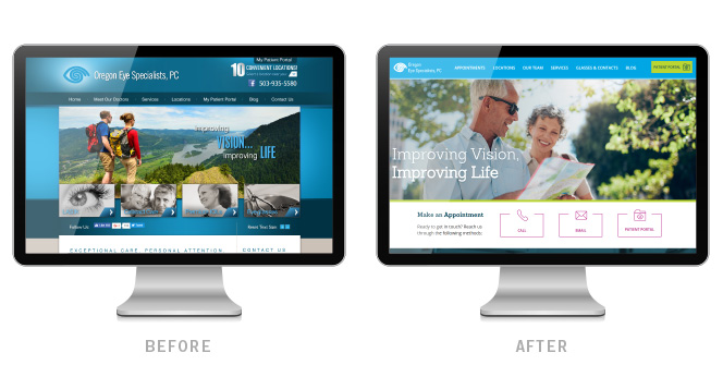
Like all of our clients, the website process for Oregon Eye Specialists began with an exploration of their competitive landscape. What we found was a lot of the same: unremarkable stock photography, stuffy medical jargon, and cold, anatomical illustrations.
OES' mission is clarity—which extends far beyond eye care. They strive to bring authenticity and transparency to a patient experience that is often confusing and impersonal. To this end, we reimagined their website to include unique custom photography—creating a approachable digital environment, introducing their team of friendly eye doctors, and welcoming patients into their clinics.
Everything—from the bright, vibrant colors, to the nontraditional typefaces, to the use of brand patterns and iconography—helps this site convey what truly sets Oregon Eye Specialists apart in their industry.
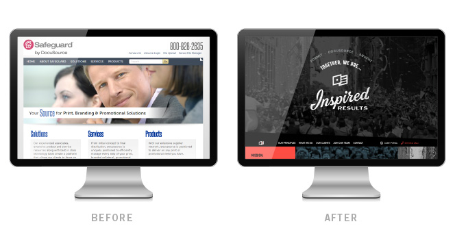
Formerly three separate companies—DocuSource, Formit, and Advent—Inspired Results needed a brand that synthesized these disparate identities. Fortunately, the company is leading the brand management revolution, which made for a remarkable brand story.
The inspiration behind this logo, website, and visual identity was rooted in the celebrations of progress throughout human history—and people joining together to support a cause bigger than themselves. Our team tapped into the spirit that characterizes the leaps of faith required to challenge the status quo.
Stylistically, the brand has all the makings of a grassroots operation. The hand-lettered logo pays homage to hand-painted signs, and their simple flag mark is "the symbol of the movement," as an emblem people can rally behind. Interesting use of texture gives the feeling of handcrafted grit. Colors are a contemporary take on primary reds and blues—adding a nontraditional hue to a familiar combination. At every turn is a reminder of the human element required to band together and make history.
To learn more about our brand transformation process, check out our Portfolio.


Stop competing on price! Learn how to combat commoditization — exemplified by the Makino’s effect on the manufacturing industry.

It’s time to take your organization from the best-kept secret to the next big thing. Find out how!
Get insights like this straight to your inbox.