Culture in Mergers & Acquisitions
When it comes to Mergers and Acquisitions, one major contributor to the valuation process often gets overlooked: company culture.
I love orange juice. In fact, nothing beats a tall glass of cold OJ with breakfast. So, you can imagine my interest when I learned that Tropicana had engaged a high-end design firm to redesign its line of juice products.
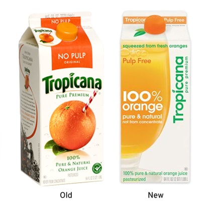
What's even more interesting is that I've since learned that they've decide to go back to their old design after some customer complaints. Rather than trying to explain the whole story, here's a photo of the old and new packaging, from this website:

For a bit of background, you can read this post or this post.
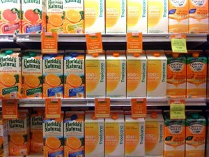
Many argue that the new design is lackluster and positions the brand as a generic. While I don't think they're entirely off-base, my friend Greg Hinzmann makes a great point about reviewing design within the context of the competition. Here's a great photo from his blog showing how the new Tropicana looks amidst the competition.

Greg makes a compelling argument that the Tropicana redesign is an attempt to lead the industry. By designing a new package distinct from Florida Natural, Organic Valley, and others, they are setting their product apart to eliminate brand confusion. It's a compelling argument and a good reason to redesign the package. In fact, as you look at the crowded shelf, it's actually a series of "me too" designs. The curved fonts, large orange slices, and green/orange color schemes make all the products seem as if they are iterations of the same idea.
The problem here isn't one of strategy. On the contrary - Tropicana did exactly the right thing by acknowledging the need to differentiate their product. The problem is the design solution, while differentiating, fails to retain the equity of the brand. Let me explain...
Orange juice is generally a breakfast drink, and for many people, breakfast is an event close to the heart. Think about it: breakfast in bed, Easter breakfast, breakfast with the family, so on an so forth. Parents give their kids orange juice before school, business people drink it during morning meetings...it's tied to events both mundane and emotional. Given the relationship between Tropicana and its customers, I would assume that the #1 design priority would be to retain the immediate brand recognition.
The problem with the new packaging is that the design solution falls short. Instead of augmenting the brand, the designers pushed the Tropicana logo to the upper corner, shrunk it in size, and turned it 90 degrees. The large glass of orange juice is nice, but not really distinct. The package uses white space to great affect, but it feels like a design that could have just about any brand stuck on it (hence the association with generics and store-labeled products). While I like the attempt at moving away from the clutter of the competition, the design simply feels as if its an import. Almost as if the design firm took an understated european "look," applied it to Tropicana and called it a day.
Sadly the "lesson" that Tropicana and others will take from this experience is that it's easier to stick with a safe bet than to risk new designs. Unfortunately, returning to the previous packaging is a knee-jerk response that fails to solve the underlying problem of brand confusion. What Tropicana should do is go back to the design drawing board. They should hire a firm that better understands the value in retaining brand equity while positioning the product for the future.
Smart exectuives use design to lead their business to greater profitability and mindshare. Companies like Apple, Dyson, and BMW lead with design, enjoying loyal customers, higher profit margins, and sustainable long-term growth.
Get insights like this straight to your inbox.